
It’s Friday and its therefore time for The Stored Investor’s chart of the week. Each week we publishes a chart that is at the very least tangentially related to investing.
To make this interesting the chart is shown without a title or axis labels, just the numbers, no units. A number of other hints are available below to be opened as seen fit and of course skipping to the big reveal is perfectly fine as well.
Here’s the chart:
Hint 1
Those are ages along the y-axis and monetary values along the x-axis
Hint 2
Multiple countries are being compared. The colour indicates the region of the world the country is in.
Hint 3
Look at that cluster of pink markers on the lower left of the plot. Multiple countries from one region are performing poorly on both measures.
Click here to reveal the chart in full and the rest of the discussion
This weeks chart is a classic. It plots life expectancy in 2020 against 2020 GDP per capita in US$ for as many countries as I had data for. The points are colour coded according to the region the country is in.
The big takeaway is that as GDP per capita increases life expectancy increases. The effect is especially pronounced at low levels of GDP per capita, where modest increases in GDP are associated with decades longer life expectancy.
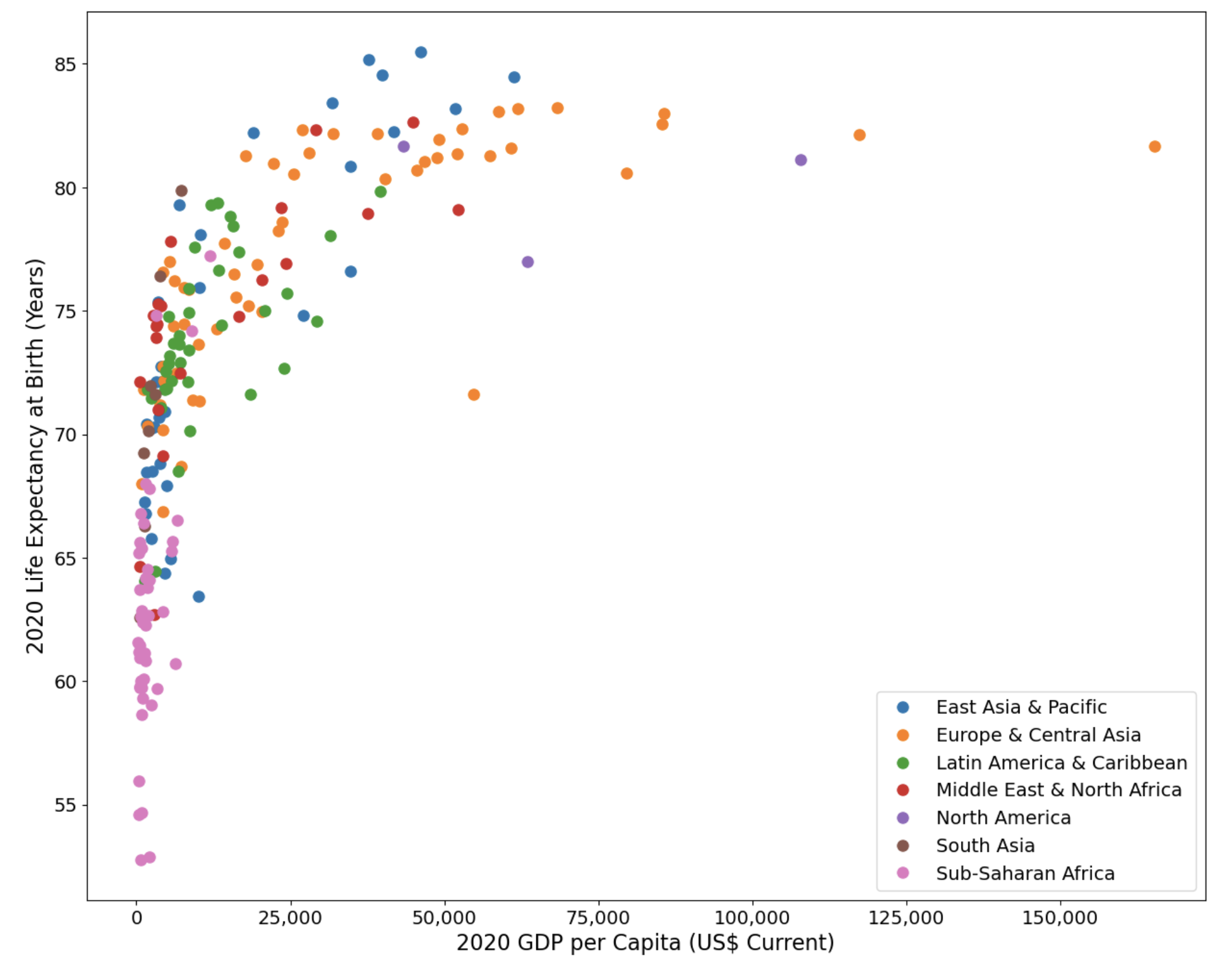
The preponderance of very low GDP per capita and very low life expectancy are in Sub-Saharan Africa. It is in these countries that significant increases in life expectancy can be archived with modest increases in GDP per capita.
The very highest life expectancy countries are not necessarily the highest GDP per capital ones, but they tend to be in East Asia and the Pacific. This seems to suggest that once you get over a certain GDP per capita then further increases are not necessarily associated with longer expected lives. Look at that point right on the right of the chart. It is Liechtenstein, where the GDP per capita is US$ 165,284 and the life expectancy is 81.7. That’s not as high as many East Asia and Pacific countries yet they have half the GDP per capita of Liechtenstein. You might have though the rightmost marker was Monaco. That would be even further to the right with a GDP per capita of US$ 182,537, but the dataset for 2020 did not include a life expectancy so it could not be plotted.
The orange data point towards the middle of the plot, that has GDP per capita of US$ 54,694 but a life expectancy of 71.6, which is below what might be expected is Greenland.
